Email Sign Up Forms: Triggers, Placements and Conversions
 Email marketing has it’s own set of strategies, collecting subscribers tends to be a strategy all it’s own.
Email marketing is of little benefit without subscribers, and how you go about getting subscribers can be challenging. Sign up forms are a necessity, but what method and placement of the forms will provide the best results? Here are a few examples and suggestions:
Your About Us Page
If you look into your site statistics you might notice that new visitors will visit your about page more than returning visitors, and that makes complete sense. They’ve arrived and want to know who you are and what your business is all about. A subscription form on your about page can take advantage of that traffic and capture them while they’re doing their research, and engaging their curiosity about your products and services.
At The Top Of The Sidebar or In The Header
A sign up form that is visible on every page load is a productive placement, as users will notice the option while they are browsing your pages and blog posts. This tends to be my favorite. Should they decide to continue their tasks later they can subscribe and stay informed, or should they make a purchasing decision for a later date subscribing allows them the benefit of your reminders.
The Header of Your Landing Pages
One highly effective method of gathering subscribers is to make the sign up form the first thing they see. Consider this, you click on a link and arrive at a web site looking for a company that supplies custom labels for a line of apparel you’re selling. You land on their site and all you see is their logo, a short description telling you they handle custom labels of all sizes and colors – no minimums – and provide a quick turnaround time. Subscribe to their newsletter to stay informed.
You found what you were looking for, why not sign up before diving into their site for more details? This can be a very effective way to gather subscribers.
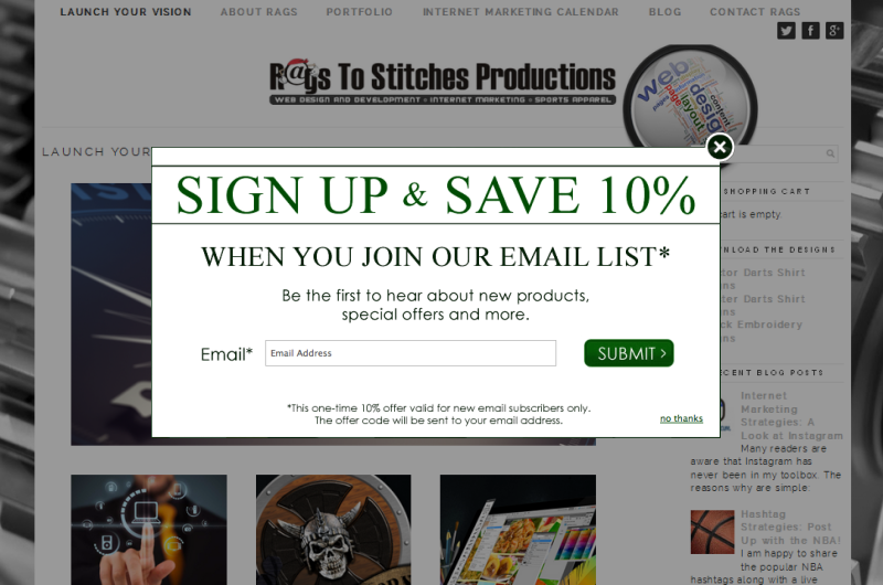
The Lightbox
You’ve no doubt seen the lightbox pop-up window, either asking you to sign up for a newsletter, sign a petition or buy something right then and there before ever reaching the site. Depending on your market, audience and products/services this can be either highly successful or a complete catastrophe.
For example, when you arrived here if my site looked like this, would you still be here or would you have moved on due to being stopped at the starting line?
The Footer Placement
From a web designers perspective, I feel like footers are beneficial in many ways. I once had a client ask me why I added social media links, their email signup form and a navigational menu to the bottom footer of their layout, citing the fact that it was repeat information that had already been displayed at the top of the page.
My answer is in the form of a question; what do you want the user to do when they reach the end of the page? The footer is a great place to give them either more things to discover, a way to engage with you through social media or place a call to action.
Under Your Product Images
The call to action in it’s simple form – stay informed with our newsletter! – under each product image provides visitors with the fast and easy method of deciding they found what they want, and they’re interested in your messages. Just like any other call to action, the get a quote button, contact us button and more, the subscribe button or short form reaches out for triggering and taking action.